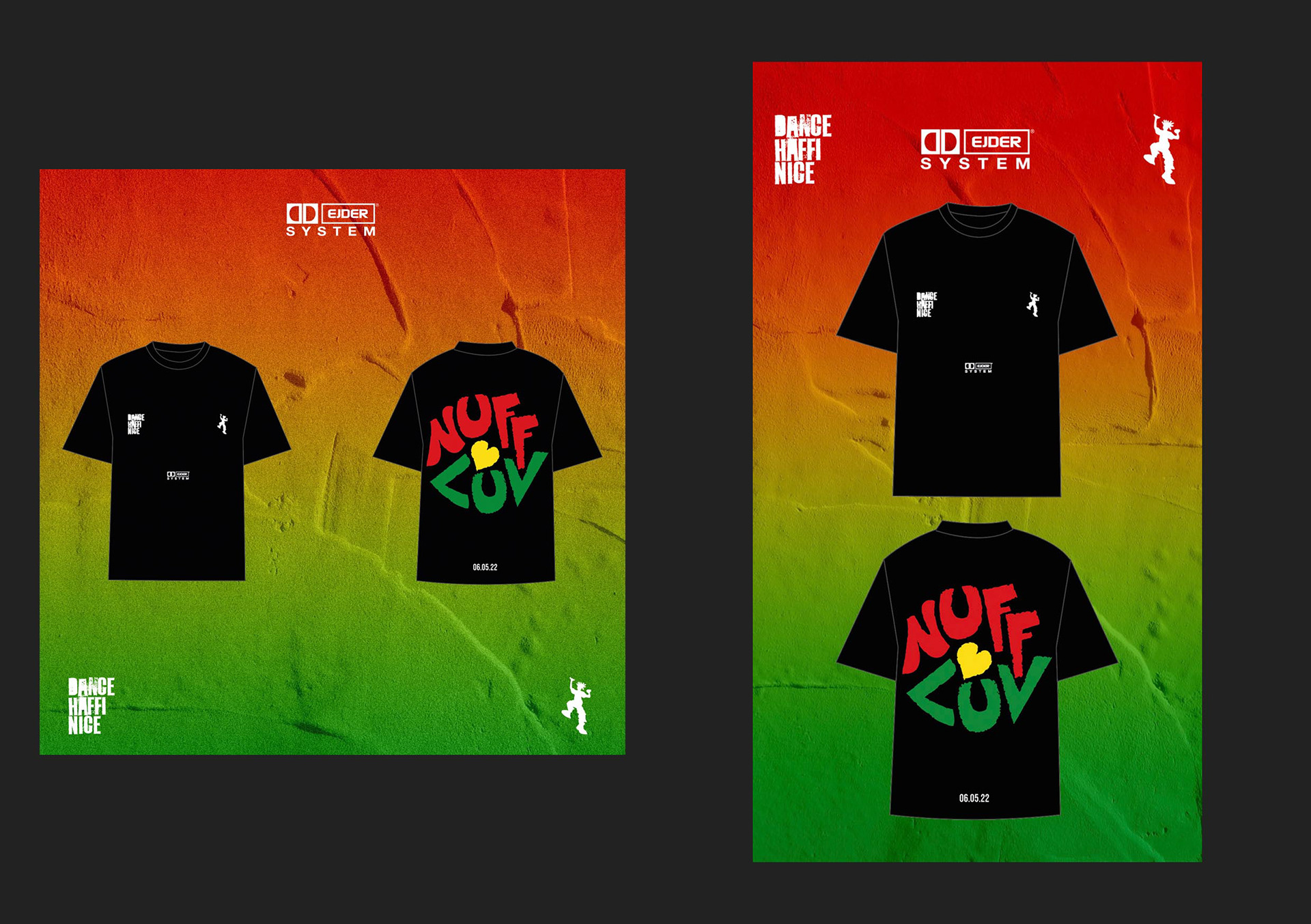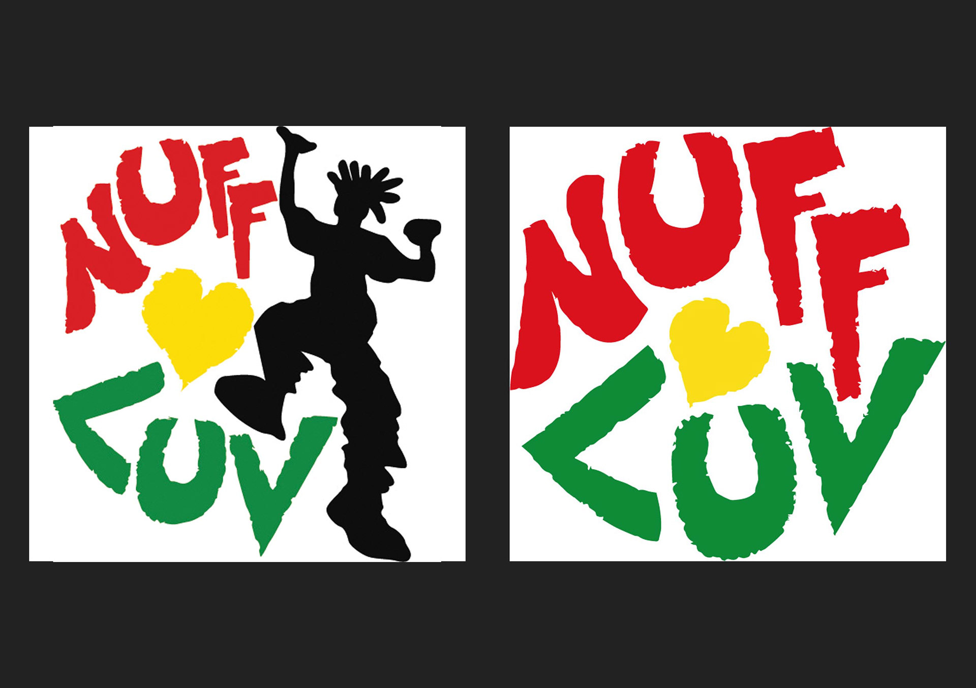
With the front of the shirt having both DHN and EJDER logos, it meant that the main focus of the design would be on the rear. I came up with two possible designs that could make it to the final shirt which involved a stylised type as well as a dancing figure which is something that we had spoken about.
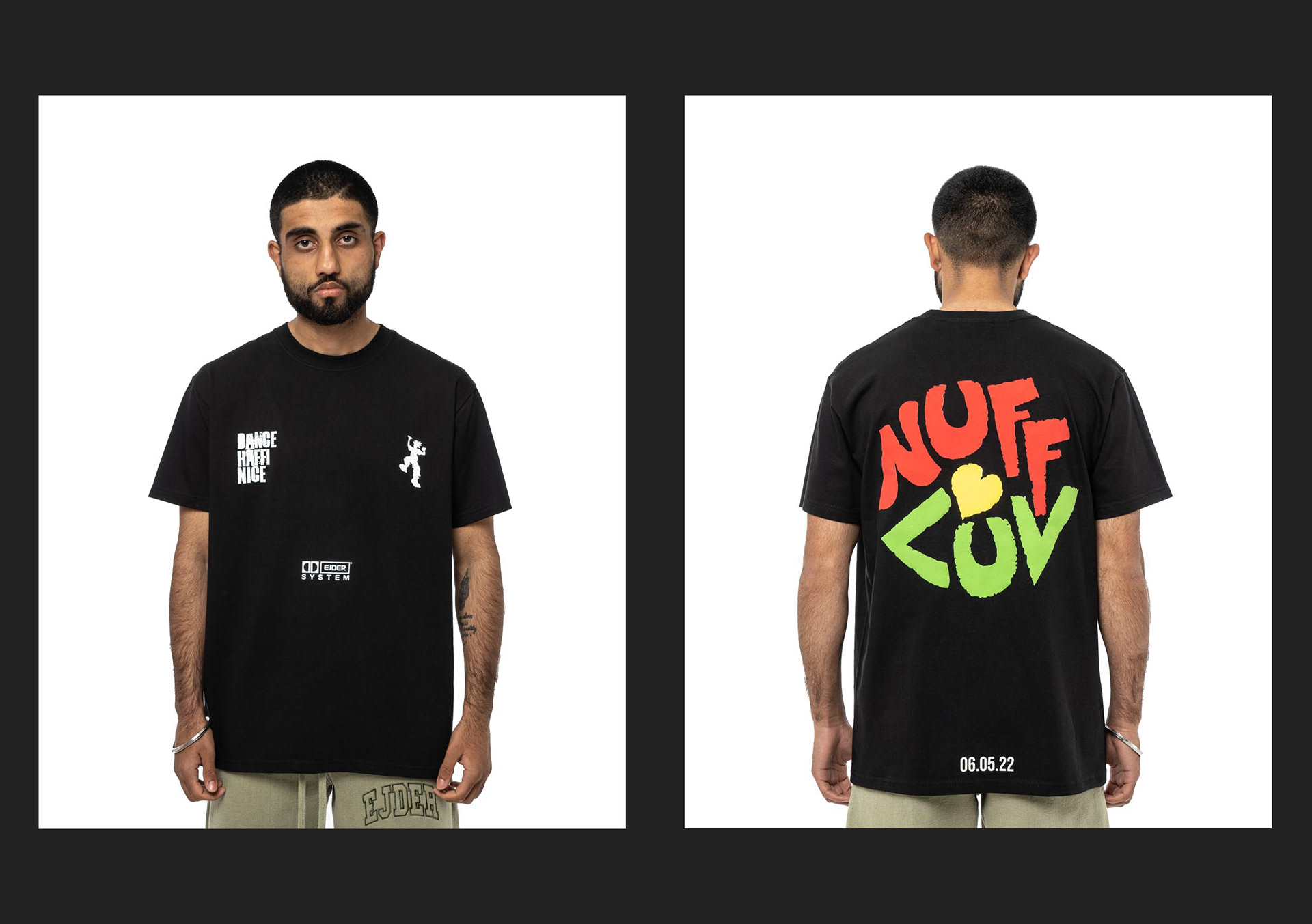
The final design: Front design had all brand logos in white
Rear design saw the removal of the figure and keeping the 3 key colours with the date of the event at the bottom. The main graphic would also be applied in a puff print rather than a standard screen printing method
Along with the normal social media content around the event I created and edited a video to help promote the event, taking advantage of social media platforms favouring short form video content over more traditional forms.